Colour is an alchemical force that can trigger reactions, manipulate mood and can even change the mindset. A brand’s choice of brand colour is a fundamental element to reinforce the personalities and qualities of the product and/or services that it offers.
Based on the research conducted by Colorcom – The Color Consultant Experts, “Consumers make a subconscious judgment about a person, environment or product within 90 seconds of initial viewing and that between 62% and 90% of that assessment is based on colour alone.
” Further research shows that brand recognition can effectively be increased up to 80% by using appropriate colour in marketing, packaging and logo designs.
Some brands are so iconic that they made it possible for the consumers to identify them from single Pantone of colours even without accompanying logo while some other brands like Barbie and Cadbury have gone a step up and have trademarked their defining shades even!
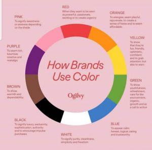
Here let us see some of the brands that have used brand colours as per the above chart!
Brand colour choices

Image taken from Ogilvy
RED: CNN, H&M, KFC, Virgin, Coca-Cola, NETFLIX
When they want to be seen as powerful, passionate, exciting or to create urgency.
Eg :
1.NETFLIX
Netflix is an American media services provider and production company which have always created urgency in the minds of young to watch TV shows and movies, by giving them hues of the most popular and exciting dramas and pictures
2.H&M
Hennes & Mauritz Swedish multinational clothing retail is known for its fast-fashion clothing for men, women, teenagers and children which creates excitement on seeing their outfits.
ORANGE: Nickelodeon, Fanta, JBL
To energise, seem powerful, rejuvenate, to create a sense of haste and to seem affordable.
Eg:
1.JBL
JBL is an American company that manufactures audio equipment including loudspeakers and headphones. They might have used orange with the sense to create haste but on the contrary, JBL is nowhere near affordability.
2.Fanta
Fanta is a brand of coca-cola but is a fruit flavoured carbonated drink. As the colour suggests it rightly fits into the category of energy, rejuvenation and affordability.
YELLOW: McDonald’s, Ferrari, Snapchat
To show that they are fun, friendly, optimistic, confident and to grab attention but also to warn.
Eg:
1.McDonald’s
McDonald’s is an American fast-food company which is known for its fun-loving foods and friendly environment.
2.Snapchat
Snapchat is a messaging app used globally not just for texting but also for taking selfies with different filters which implicitly satisfies the conditions of fun and grabbing attention.
GREEN: Tropicana, Starbucks, Mountain Dew, Android, Tic Tac
To show youthfulness, refreshment, care for the environment, organic, growth and as a call to action.
Eg :
1.Tropicana
Tropicana is an American multinational company which makes fruit-based beverages. It marks its presence as refreshment, organic and care for the environment.
2.Mountain Dew
Mountain Dew is a carbonated soft drink brand of PepsiCo which abides by youthfulness and call to action even in their ads.
BLUE : Samsung, Oral-B, Dell, hp, Ford, Twitter, VISA
To appear calm, honest, logical, caring and trustworthy.
Eg :
1.Oral-B
Oral-B is an American oral hygiene company that satisfies the properties like honesty, caring and trustworthy. And yes, this brand has been recommended by many doctors and is proven.
2.VISA
VISA is an American financial service and with no doubt it is trustworthy!
BLACK & WHITE: Apple, Adidas, Nike, Puma, Sony
To signify luxury, exclusivity, sophistication, authority and to encourage impulse purchases.
Eg: With no doubts, all the above-mentioned products satisfy all the properties like luxury, exclusivity, sophistication, and to encourage impulse purchases.
BROWN: Hershey’s, Ferrero Rocher, m&m’s
To show warmth and dependability.
Eg :
1.Ferrero Rocher
Ferrero Rocher gives the consumers a unique taste experience of contrasting layers of chocolate and hazelnut which makes it dependable obviously! Make some noise Ferrero Rocher fans!!!
On the whole Brown colour has been used mostly by chocolate companies which is why maybe we all feel warm and dependable on CHOCOLATE at all occasions and moods!!!
PINK: Barbie, Breast Cancer Foundation, Donut King
To signify sweetness or sexiness depending on the shade.
Eg :
1.Barbie
Barbie is a fashion doll manufactured by an American company which is obviously sexy.
2.Donut King
Donut King is an Australian doughnut franchise which is not for super tasty and sweet doughnuts.
PURPLE: Cadbury, Yahoo!, Hallmark
To seem rich, luxurious, creative and nostalgic.
Eg :
No No No… None of the above seems to be rich or luxurious or creative or nostalgic… Then why did they use that colour??? I know right…there is a flash of hint in your mind supporting those brands… We are hearing you… Just go down and comment for us to learn from each other!
Hope you got some clarity about brand colour…
Now it’s your turn! You can also comment as many brands as you want in the comments which satisfy and contradict with the properties of each colour. So… Go, pick your favourite colour and let us know your valid points….!
To read recent news, please visit our news page.
